A New Look for Pixelarticons
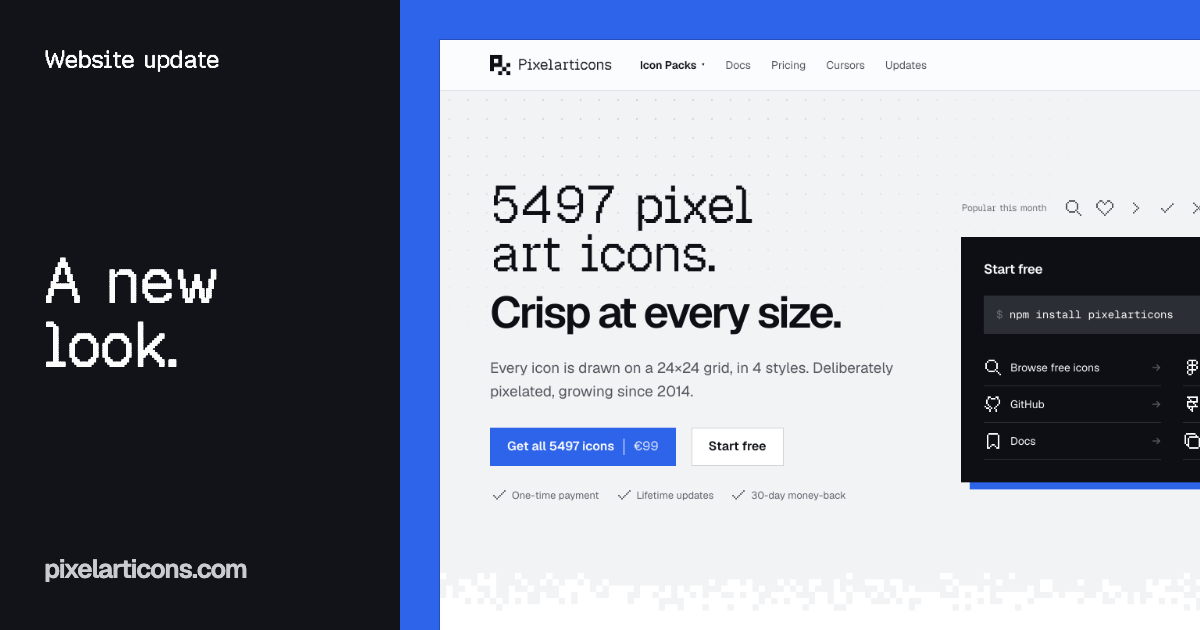
pixelarticons.com has a new design. Same icons, same prices, same free set. What changed is how the site looks and how fast you find what you came for.
Pixels where they count
The headlines now open with a line in Geist Pixel, a pixel typeface, and close with a line in Geist. Prices, numbers, labels and tags use the pixel font too. Everything you actually read, from descriptions to FAQs, stays in Geist so it is easy on the eyes.
Code and icon names use Geist Mono. All three fonts load from this site, with no third-party requests.
One color for the next step
The palette is ink on paper, with one accent: Cobalt. It marks the action that matters on each page, like “Get all icons” or the buy button on pricing, and nothing else.
Each set has its own color now: Base is Cobalt, Mini is green and Prime is gold. You see them on the new Gumroad covers and on the pricing page.
Square, on a grid
Every corner is square and every line is a 1px hairline, like the grid the icons are drawn on. Buttons are flat. The only shadow left is the hard offset on the two cards that ask you to start: the free card at the top of the homepage and the Pro card further down.
The new pixel pattern dissolves the page into the footer, and a lighter version sits under the homepage hero and on the updates page.
What is new on the pages
- Homepage: the free options sit in one card next to the headline: the npm command, the Figma file, GitHub, Framer, the docs and the prompt for your coding agent. The ten most popular icons of the month sit right above it.
- Icon browser: every tile now says FREE or PRO, so you can tell what is in the free set before you click.
- Pricing: each set shows its cover and ten real icons from the set, and the bundle cover follows the seat plan you pick.
- Updates: every post now has its cover in the list, and the newest one gets a featured spot.
- Brand: a new brand page with the logo, the mark, the colors and the fonts. Writing about Pixelarticons? Take what you need.
Faster and easier to read
The redesign keeps the site at 100 for accessibility in Lighthouse, and close to 100 for performance. The accent and the grey text were tuned so they pass the WCAG contrast rules, and the old X embed on the cursor page is gone, so that page no longer loads a script from another site.
The dark theme is gone for now: the new design is built for light. If you miss it, tell me.
The count is now 5497
While rebuilding the pages, I found seven duplicate files in the set: the same icon, stored twice. They are gone, so the real count is 5497 icons, not 5504. No icon you use went away.
Tell me what you think
This is a big change. If something looks off, breaks or is hard to find, ping me on X at @halfmage.